

Streamlit: your first webapp#
Streamlit is a popular web application framework designed for building rich interactive applications using Python. In this article, you will develop and deploy a Streamlit application in Dataiku.
Prerequisites#
Dataiku >= 14.3.0
A Python 3.9 or later code environment with
streamlitas additional Python package.
Important
Streamlit 1.57 requires DSS 14.5.3 or later. If you are using DSS 14.5.2 or earlier, use Streamlit 1.56 or earlier.
Preparing the source data#
This tutorial is inspired by one of Streamlit’s demos and mostly reuses the same code and data.
Start by downloading the source data following this link and make it available in your Dataiku Project, for example, by uploading the .csv.gz file to it. Name the resulting Dataiku dataset uber_raw_data_sep14.
The dataset contains information about Uber pickup dates, times, and geographical coordinates (latitude and longitude). To better understand this data, you will build a few data visualizations in the rest of the tutorial. But first, you need to set up the web app’s edition environment.
Creating the web app#
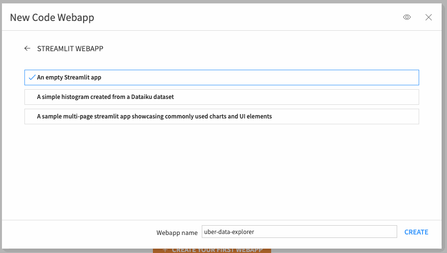
In your project, open the webapps page and click +New webapp > Code webapp > Streamlit > Empty Streamlit app.
Name your application as you like, for instance, uber-data-explorer.
The app has been created, but hasn’t been started yet. To start, open the Settings tab and set Backend > Code env to your streamlit-enabled Python code environment. Then, click Save above. This will save the settings and also start the app.
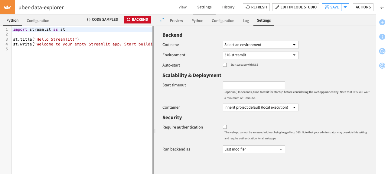
After the app starts, you should see the “Hello Streamlit!” title with some text under it.
Editing the webapp source code#
Now, let’s make your app do something. Replace the sample Python code with this one:
import streamlit as st
import dataiku
import pandas as pd

DATE_TIME_COL = "date/time"

#############
# Functions #
#############

@st.cache_resource
def load_data(nrows):
    dataset = dataiku.Dataset("uber_raw_data_sep14")
    df = dataset.get_dataframe(limit=nrows)
    lowercase = lambda x: str(x).lower()
    df.rename(lowercase, axis='columns', inplace=True)
    df[DATE_TIME_COL] = pd.to_datetime(
        df[DATE_TIME_COL],
        format="%m/%d/%Y %H:%M:%S"
    )
    return df

##############
# App layout #
##############

data = load_data(nrows=10000)

st.title('Uber pickups in NYC')

if st.checkbox('Show raw data'):
    st.subheader('Raw data')
    st.write(data)
The structure of the code is split into two:
The Functions part contains all functions that rule the behavior of the application.
The App layout part lists the different visual components that the application is made of, hence defining its appearance.
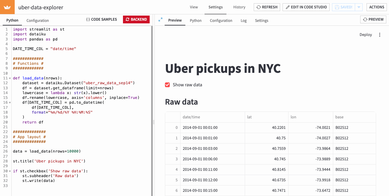
For this initial step, you created a load_data() function that retrieves the source data and turns it into a pandas DataFrame that you’ll be able to manipulate later for more advanced operations. The layout is fairly simple: it displays the content of that DataFrame as a table if the “Show raw data” box is ticked.
After saving changes, the app restarts. You should now see this in the Preview tab, if you show the raw data:
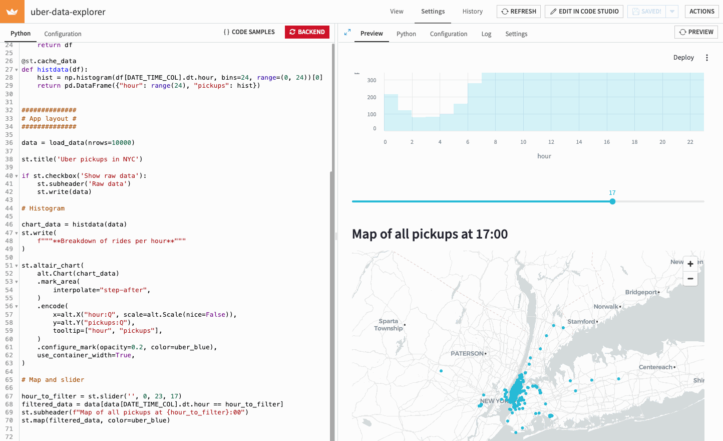
Breaking down rides by hour of the day#
Suppose you now want to investigate your data further and check if there is a particular time of day when the number of pickups is higher or lower than usual. To do so, you will create a histogram at the hour level and display it in the application. First, add a few additional dependencies to import at the beginning of the file:
import altair as alt
import numpy as np
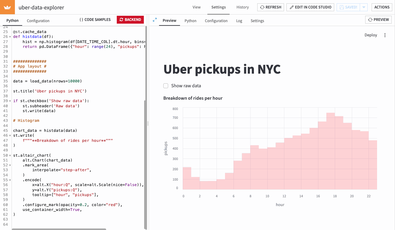
Then, add the histogram computation function to the Functions part:
@st.cache_data
def histdata(df):
    hist = np.histogram(df[DATE_TIME_COL].dt.hour, bins=24, range=(0, 24))[0]
    return pd.DataFrame({"hour": range(24), "pickups": hist})
Finally, incorporate the histogram visualization in the application by adding this to the App layout section:
# Histogram

chart_data = histdata(data)
st.write(
    f"""**Breakdown of rides per hour**"""
)

st.altair_chart(
    alt.Chart(chart_data)
    .mark_area(
        interpolate="step-after",
    )
    .encode(
        x=alt.X("hour:Q", scale=alt.Scale(nice=False)),
        y=alt.Y("pickups:Q"),
        tooltip=["hour", "pickups"],
    )
    .configure_mark(opacity=0.2, color="red"),
    use_container_width=True,
)
Save your changes and wait for the app to refresh. You should now see a nice histogram in the Preview tab:
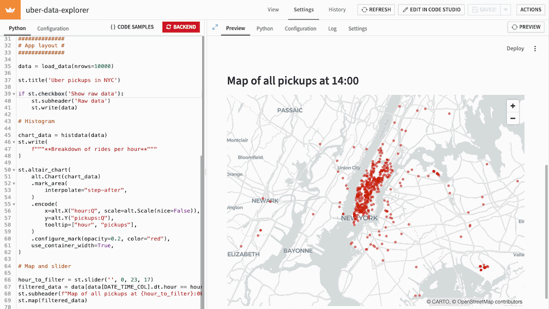
Drawing a scatter map with pickup locations#
For the final item of your application, you will create a map displaying the pickup locations. To make it more interactive, you will also add a slider to filter the data and keep only a specific hour of the day.
No additional computation is needed here, so you can directly add the following code to the App layout part:
# Map and slider

hour_to_filter = st.slider('', 0, 23, 17)
filtered_data = data[data[DATE_TIME_COL].dt.hour == hour_to_filter]
st.subheader(f"Map of all pickups at {hour_to_filter}:00")
st.map(filtered_data)
Restart the backend. You should now see a nice histogram in the Preview tab:
Customizing your app’s theme#
Streamlit apps can be themed using configuration. We will now use this to align your app’s theme with Uber’s brand color palette.
To do so, open the Configuration tab. Here you can adjust various settings, including colors and fonts. Let’s use Uber’s blue (#1FBAD6) for UI controls and Uber’s gray (#222233) for text color. Add the following two lines in the [theme] section, and click the Save button.
textColor = "#222233"
primaryColor = "#1FBAD6"
After the preview refreshes, you should now see that the slider is blue and that the text is not quite black (though this may be harder to see). But the charts and map still use red. Chart colors are not controlled by the theme but by the code. To change the color, define Uber’s blue as a variable at the top of the Python file.
uber_blue = "#1FBAD6"
And change the colors used in the chart, and for map markers, as follows:
st.altair_chart(
    ...
    .configure_mark(opacity=0.2, color=uber_blue),
                                       ^^^^^^^^^
...

st.map(filtered_data, color=uber_blue)
                    ^^^^^^^^^^^^^^^^^
Save your app one more time. You should now see a much more Uber-marketing-friendly UI!
Putting it all together#
Your webapp is now fully functional! Here is the complete code for your application:
import streamlit as st
import dataiku
import pandas as pd
import altair as alt
import numpy as np

DATE_TIME_COL = "date/time"
uber_blue = "#1FBAD6"

#############
# Functions #
#############

@st.cache_resource
def load_data(nrows):
    dataset = dataiku.Dataset("uber_raw_data_sep14")
    df = dataset.get_dataframe(limit=nrows)
    lowercase = lambda x: str(x).lower()
    df.rename(lowercase, axis='columns', inplace=True)
    df[DATE_TIME_COL] = pd.to_datetime(
        df[DATE_TIME_COL],
        format="%m/%d/%Y %H:%M:%S"
    )
    return df

@st.cache_data
def histdata(df):
    hist = np.histogram(df[DATE_TIME_COL].dt.hour, bins=24, range=(0, 24))[0]
    return pd.DataFrame({"hour": range(24), "pickups": hist})


##############
# App layout #
##############

data = load_data(nrows=10000)

st.title('Uber pickups in NYC')

if st.checkbox('Show raw data'):
    st.subheader('Raw data')
    st.write(data)

# Histogram

chart_data = histdata(data)
st.write(
    f"""**Breakdown of rides per hour**"""
)

st.altair_chart(
    alt.Chart(chart_data)
    .mark_area(
        interpolate="step-after",
    )
    .encode(
        x=alt.X("hour:Q", scale=alt.Scale(nice=False)),
        y=alt.Y("pickups:Q"),
        tooltip=["hour", "pickups"],
    )
    .configure_mark(opacity=0.2, color=uber_blue),
    use_container_width=True,
)

# Map and slider

hour_to_filter = st.slider('', 0, 23, 17)
filtered_data = data[data[DATE_TIME_COL].dt.hour == hour_to_filter]
st.subheader(f"Map of all pickups at {hour_to_filter}:00")
st.map(filtered_data, color=uber_blue)
And here is the theme section of its Configuration
[theme]
textColor = "#222233"
primaryColor = "#1FBAD6"
Wrapping up#
In this tutorial, you saw how to get started building Streamlit applications in Dataiku. Note that the code and configuration can also be edited in a Code Studio. This is covered in other tutorials.